I once went to a talk given by the chief book-buyer for WHSmith Travel, where he talked about his process for choosing which books to stock in his shops (the branches of WHSmith you see in railway stations, airports and motorway service stations). First of all he looked at the cover, then at the blurb on the back and finally, way back in third place, the text. How does THAT make you feel, fellow writers?
Covers are AMAZINGLY important, and this applies even if (like me) most of your books won’t get anywhere near WHSmith Travel, or indeed any other bookshop (MRS DARCY made it into the high street branches of WHSmith for a few weeks as well as Waterstones, and I managed to persuade Foyles in Bristol to take a copy or two of TAKE IT COOL, but that’s about it).
So for a writer, the first time you see your cover can be an anxious time. This is make or break stuff.
Every publisher is different, incidentally. For instance, the first thing I knew of MRS DARCY’s cover being released was when I was tagged into an image of it on Facebook. I didn’t have any input into the cover for DOT DASH either. On the other hand, the cover for TAKE IT COOL was taken directly from my initial mockup, but cleaned up and with the grooves of the record enhanced. My input to LOVE AND LOSS AND OTHER IMPORTANT STUFF was vaguer, consisting of me basically saying, oh, I dunno, maybe something with Cupid on top of a skull?
(In case anyone’s trying to read between the lines, I should emphasise right away that I am EXTREMELY happy with all of these covers, whatever the process.)
For DIP FLASH, I mocked up something with headlights in fog, with “stories by” in one headlight and “Jonathan Pinnock” in the other, which looked pretty terrible but had the germ of an idea in there. And this is what Cultured Llama’s graphic designer, Mark Holihan, came up with:
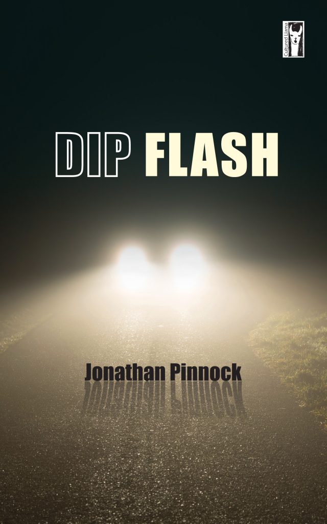
Isn’t that amazing? I am utterly delighted and I think the shadows i particular are a master stroke.
I was so pleased, I went straight away to add it to the gallery of book covers on this site, at which point I realised that the new theme I’ve been using for a while (Sydney) has got a really terrible default gallery layout. So I hunted around and found a much better gallery plugin, Envira, which is really stylish. Take a look at this, for example. I was so pleased, I decided to incorporate it into the anthology gallery as well and then the one for software books. I could watch the way the images combine together all day.
Finally, I should probably mention that DIP FLASH is now available to order at the Cultured Llama website. If you want a signed copy, I’ve added it to the shop here too.
1 thought on “DIP FLASH Gets a Cover”